Tabs are one of the most popular and enduring UI (User Interface) design patterns in web development. Modeled after traditional manila file folders, tabs allow users to switch between different views or sections of content within the same context.
When used correctly, tabs offer massive benefits for both user experience (UX) and website performance.
Major Benefits:
- Declutters the Page (Saves Screen Real Estate)
- Improves User Navigation & Orientation
- Improves “Scannability” and Organization
- Boosts Performance
- Faster Access to Information
There are many ways to create tabs for Xperience by Kentico (XbK), but I will settle for the easiest way: custom Page Builder Section.
Sections are components that define the layout of widget zones within editable areas. You can define any number of different sections and allow content editors to choose them in the Pages application. More info on XbK Sections.
For this example I’m using Bootstrap 5 framework for UI.
Within your XbK project under Sections folder (if you don’t have one created it under Components folder) create a new folder called Tabs.
Add the following two files: TabsProperties.cs and _Tabs.cshtml
TabsProperties.cs
using Kentico.Forms.Web.Mvc;
using Kentico.PageBuilder.Web.Mvc;
using System;

public class TabsProperties : ISectionProperties
{
    // Register a random GUID for panel
    public Guid WidgetID { get; set; } = Guid.NewGuid();

    [EditingComponent(TextInputComponent.IDENTIFIER, Order = 1, Label = "Tab 1", ExplanationText = "Tab 1 Title")]
    public string Tab1 { get; set; } = "Tab 1";

    [EditingComponent(TextInputComponent.IDENTIFIER, Order = 2, Label = "Tab 2", ExplanationText = "Tab 2 Title. Leave empty if no tab to be displayed")]
    public string Tab2 { get; set; }

    [EditingComponent(TextInputComponent.IDENTIFIER, Order = 3, Label = "Tab 3", ExplanationText = "Tab 3 Title. Leave empty if no tab to be displayed")]
    public string Tab3 { get; set; }

    [EditingComponent(TextInputComponent.IDENTIFIER, Order = 4, Label = "Tab 4", ExplanationText = "Tab 4 Title. Leave empty if no tab to be displayed")]
    public string Tab4 { get; set; }

    [EditingComponent(TextInputComponent.IDENTIFIER, Order = 5, Label = "Tab 5", ExplanationText = "Tab 5 Title. Leave empty if no tab to be displayed")]
    public string Tab5 { get; set; }

    [EditingComponent(TextInputComponent.IDENTIFIER, Order = 6, Label = "Tab 6", ExplanationText = "Tab 6 Title. Leave empty if no tab to be displayed")]
    public string Tab6 { get; set; }

    [EditingComponent(TextInputComponent.IDENTIFIER, Order = 7, Label = "Tab 7", ExplanationText = "Tab 7 Title. Leave empty if no tab to be displayed")]
    public string Tab7 { get; set; }

    [EditingComponent(DropDownComponent.IDENTIFIER, Label = "Background Color", Order = 8)]
    [EditingComponentProperty(nameof(DropDownProperties.DataSource), "none;None\r\nblue-color;Blue\r\nyellow-color;Yellow\r\nlight-gray-color;Light Gray\r\nred-color;Red\r\ngreen-color;Green\r\norange-color;Orange")]
    public string BGColor { get; set; }

    [EditingComponent(DropDownComponent.IDENTIFIER, Label = "Extra Padding", Order = 9)]
    [EditingComponentProperty(nameof(DropDownProperties.DataSource), "none;None\r\npt-2 pb-2;2x Padding Top and Bottom\r\npt-3 pb-3;3x Padding Top and Bottom\r\npt-4 pb-4;4x Padding Top and Bottom;\r\npt-5 pb-5;5x Padding Top and Bottom;\r\npt-2;2x Padding Top Only;\r\npt-5;5x Padding Top Only;\r\npb-2;2x Padding Bottom Only;\r\npb-5;5x Padding Bottom Only;")]
    public string BGPadding { get; set; }

    [EditingComponent(CheckBoxComponent.IDENTIFIER, Order = 10)]
    [EditingComponentProperty("Label", "Hide Section?")]
    public bool HideSection { get; set; } = false;

    [EditingComponent(TextInputComponent.IDENTIFIER, Order = 11, Label = "CSS Class", ExplanationText = "Example: shadow rounded p-2")]
    public string CSSClass { get; set; }

}
Now, create the _Tabs.cshtml
@addTagHelper Kentico.Content.Web.Mvc.WidgetZoneTagHelper, Kentico.Content.Web.Mvc
@using Kentico.PageBuilder.Web.Mvc
@model ComponentViewModel<TabsProperties>

@{
    bool editMode = Context.Kentico().PageBuilder().EditMode;
    bool isHidden = Model.Properties.HideSection;

    // 1. Get a unique ID for this specific widget instance (stripping hyphens for clean HTML IDs)
    string widgetId = Model.Properties.WidgetID.ToString("N");

    var tabs = new[] {
        Model.Properties.Tab1, Model.Properties.Tab2, Model.Properties.Tab3,
        Model.Properties.Tab4, Model.Properties.Tab5, Model.Properties.Tab6, Model.Properties.Tab7
    };
}

@if (!isHidden || editMode)
{
    string inlineStyle = (editMode && isHidden) ? "border: 15px solid #f8d7da;" : null;

    <section style="@inlineStyle" class="@Model.Properties.BGColor @Model.Properties.CSSClass">

        @if (editMode && isHidden)
        {
            <div class="col-lg-12 red-color pb-3 m-0">
                <b>This Section is Hidden! Viewable only by editors!</b> To modify, check the section properties.
            </div>
        }

        <div class="container @Model.Properties.BGPadding">

            <!-- Nav Tabs -->
            <ul class="nav nav-tabs" role="tablist">
                @for (int i = 0; i < tabs.Length; i++)
                {
                    string tabTitle = tabs[i];
                    if (string.IsNullOrEmpty(tabTitle)) { continue; }

                    string isActive = (i == 0) ? "active" : "";

                    // 2. Append the unique widgetId to the href target
                    <li class="nav-item">
                        <a class="nav-link @isActive" data-bs-toggle="tab" href="#tab-@(i + 1)-@widgetId">@tabTitle</a>
                    </li>
                }
            </ul>

            <!-- Tab Panes -->
            <div class="tab-content">
                @for (int i = 0; i < tabs.Length; i++)
                {
                    string tabTitle = tabs[i];
                    if (string.IsNullOrEmpty(tabTitle) && i > 0) { continue; }

                    string isActiveClasses = (i == 0) ? "active" : "fade";

                    // 3. Match the exact unique ID structure on the pane wrapper
                    <div id="tab-@(i + 1)-@widgetId" class="tab-pane @isActiveClasses">
                        <widget-zone />
                    </div>
                }
            </div>

        </div>
    </section>
}
This is the custom CSS I used for the tabs:
.tab-content {
	padding: 0;
	border-left: 2px solid #eee;
	border-right: 2px solid #eee;
	border-bottom: 2px solid #eee;
	background: #fff;
	border-bottom-left-radius: 10px;
	border-bottom-right-radius: 10px;
}
.tab-content .tab-pane {
	padding: 20px;
	margin: 0;
}
.tab-content .tab-pane p {
	padding: 0;
	margin: 0;
}
Next, make sure you register your new section within ComponentRegister.cs (if you don’t have one, create it under Sections folder)
// Section Tabs
[assembly: RegisterSection("Generic.Sections.Tabs",
                            "Tabs Section",
                            typeof(TabsProperties),
                            customViewName: "~/Components/Sections/Tabs/_Tabs.cshtml",
                            Description = "Section with Tabs.",
                            IconClass = "icon-tab")]
// End Section Tabs
Rebuild your XbK project and head over to your XbK Admin site.
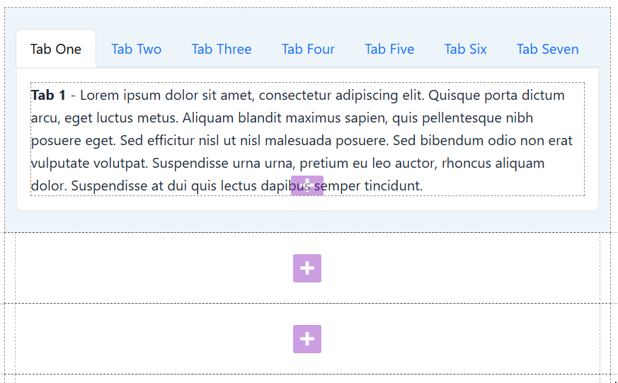
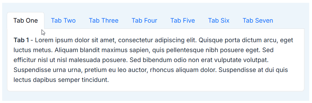
Open and edit a page and look for Tabs Section.
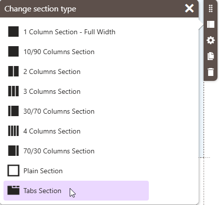
Add the Tabs Section on the page and click the cog icon “Configure section” to configure the tabs section properties.
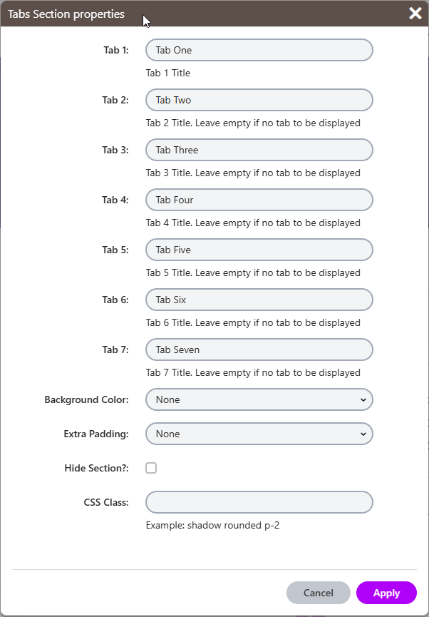
Enter up to seven tab names and then add widgets for each tab you created.